Research
- David Woolfall -
|
David Woolfall is also known as 'The London Portrait Photographer'. He is an award winning photographer based in London and works for international magazines shooting stories and individual portraits. He also works for a number of business magazines as well as shooting corporate portraits for corporate clients which include Banking and International law firms.
|

|


- Worst Photo -

|
Out of David's Collection, this is the worst in my opinion. The photo shows a man in some sort of factory. David has used the environment to show what the person does. My only major problem with this photo is that the photo was taken too far back and you can't really see the man unless you zoom the photo right in. The rule of thirds seems to have been used as the man's head is on a power spot. One thing I do like is the man isn't just standing there, he is posing which makes it different from a lot of other portraits.
|
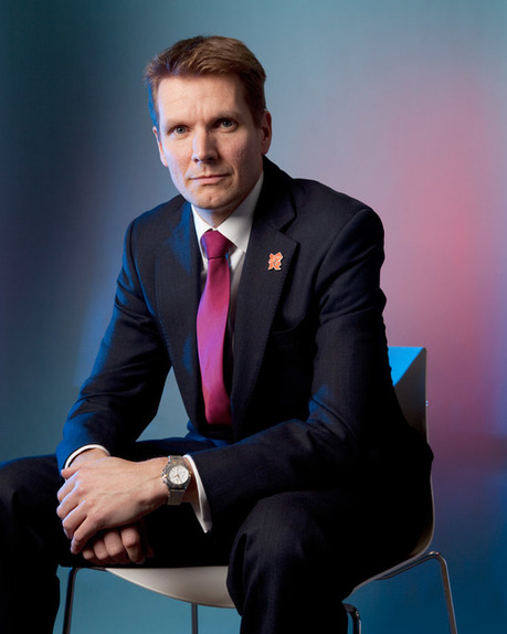
- Best Photo -
|
Out of David's collection of photos, this is my favourite. The coloured lights grab your attention right on the subject and they actually look good. The colour of his tie also goes with the pink light in the background. The pose the man is doing is also very formal but slick and the same time. He is also looking towards the camera which engages the audience. The models body creates a compositional triangle, and the black suit that he is wearing contrasts with the lighting. This helps us focus our attention on whats important. The only props used was a chair.
|

|
- David Lazar -

|
David Lazar is a travel photographer and musician from Brisbane, Australia, who loves to capture moments of life, beauty and culture through photography. He is drawn to locations which have a rich cultural background and he is especially interested in portrait and landscape photography. He has contributed to many newspaper and magazines outlets across the world, including the National Geographic.
|


- Worst Photo -

|
In my opinion this is the worst photo out of the photos I picked out of David Lazar's site. The image itself is great, but just not as good as the rest. I do like the bright colours of the dress and that it stands out from the rather dull background. The model's pose is kind of boring in my opinion as she is just standing and staring into the distance. I don't like the different composition to the others, I prefer a close up of faces. This is because you can see human emotion in the photos, also unlike the rest, this was taken from the side.
|
- Best Photo -
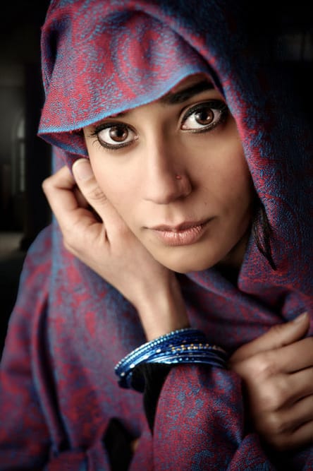
|
In my opinion this is David Lazar's best photo. He took this when he went to the middle east. The woman is doing a pose with her hands and staring directly at the camera. The colours of the scarf really pop. The lighting is soft and is focused on her face. A shallow depth of field was used as the background is slightly out of focus. The photo is taken in a head-shot composition as only her head is visible. The photographer must of shone a light onto a reflector to get the soft light on one side of her face, and defined shadows on the other.
|
- Daisuke Takakura -
|
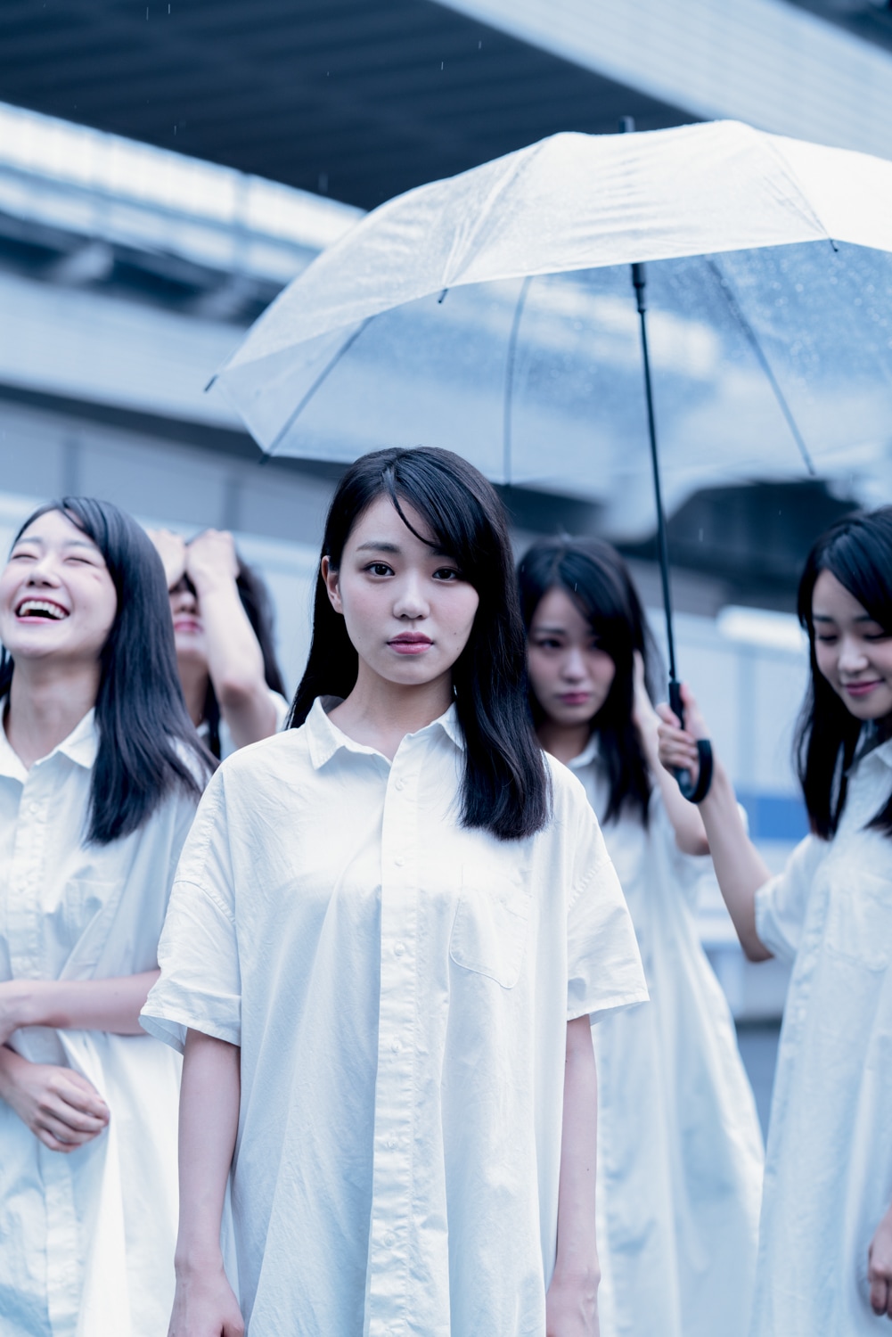
Daisuke Takakura (born in 1980) is a Japanese artist.
He is active in photography, design, theater. |


- Best Photo -
|
This is my favourite photo that he has taken. This is because of the dramatic look which goes really well with the photo. I think this image is meant to show off human emotions. He has used cloning which he has probably done in photoshop to achieve this. He has capturerd the main emotions in one picture. One of the facial expressions is laughing, one looks quite stressed anther one is upset, and one is smiling, finally there is just a neutral facial expression in the middle. In addition, he added a prop umbrella into the image, so their isn't just a blank space. I think the photographer used the rule of thirds to focus your attention on the models. It also looks like he has used a shallow depth of field, as there is an out of focus background present. The overall uses quite monotone colours. Black and white with a blue hue.
|
Photo-Shoot Ideas
|
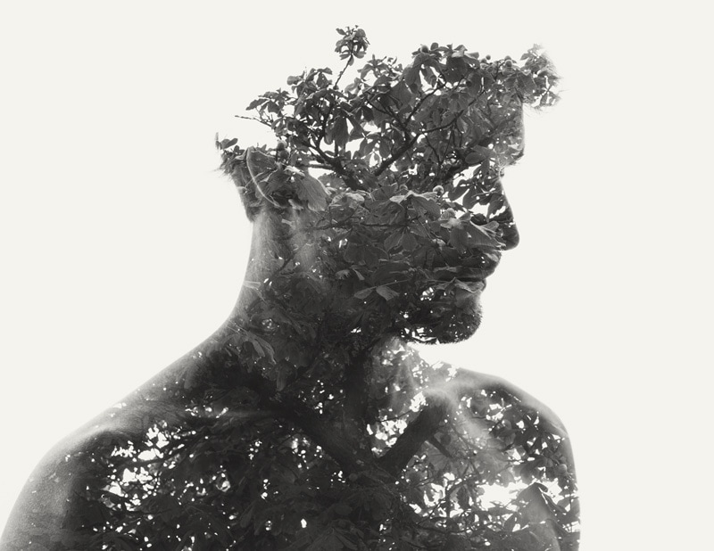
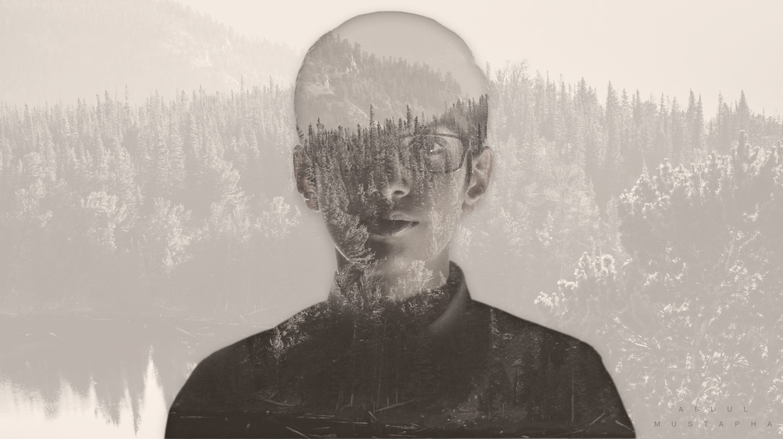
Idea 1 - Double Exposure Portrait
For this shoot, I just need an image of my model in any pose, it doesn't matter too much. Then I will use a video tutorial to work out how to do the effect in Photoshop. |
|
Idea 2 - Corporate/Professional Looking Portrait
These type of images are very simple, and can look really nice if you add lightning effects. I will just have a chair, and have a model doing various poses, and add my own twist in Photoshop. |
|
Idea 3 - Magazine Edit
Clean, Simple and Elegant. These portraits are normally taken as head on photos. They should have a clear background so its easier to crop out the background, and add text in Photoshop. |
Shoot 1
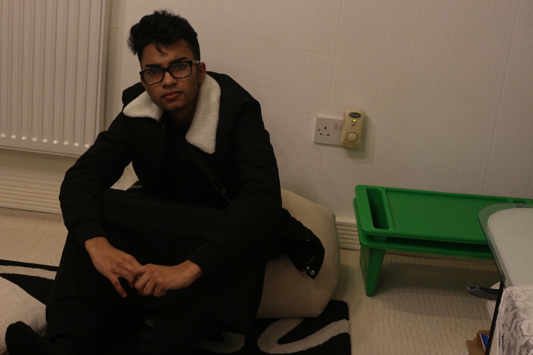
This is the original photo. The lighting was controlled but was not positioned correctly as only half the side of his face is lit up, so next time I will make sure the entire face is even and well lit. This ruined the double exposure effect.
- 1st Attempt -


Step 1 - I imported my image into Photoshop.

Step 2 - Using the Pen Tool, I removed my background and refined the edge so it was clean.

Step 3 - Added a white background layer.

Step 4 - I imported my landscape image and using layer masks I placed it over my model. Then I unlinked the two images so I could move my landscape around without my model being affected. I used this tutorial.

Step 5 - I duplicated my model layer and placed it above my landscape layer and adjusted the opacity and blending mode.

Step 6 - I added 3 adjustment layers. One of them was black and white to wash out the photo. The second was a level adjustment layer to deepen the blacks and highlights. The third was a gradient map to add a brown tint to the image.

Step 7 - I finally added the original landscape image to the background and lowered the opacity.
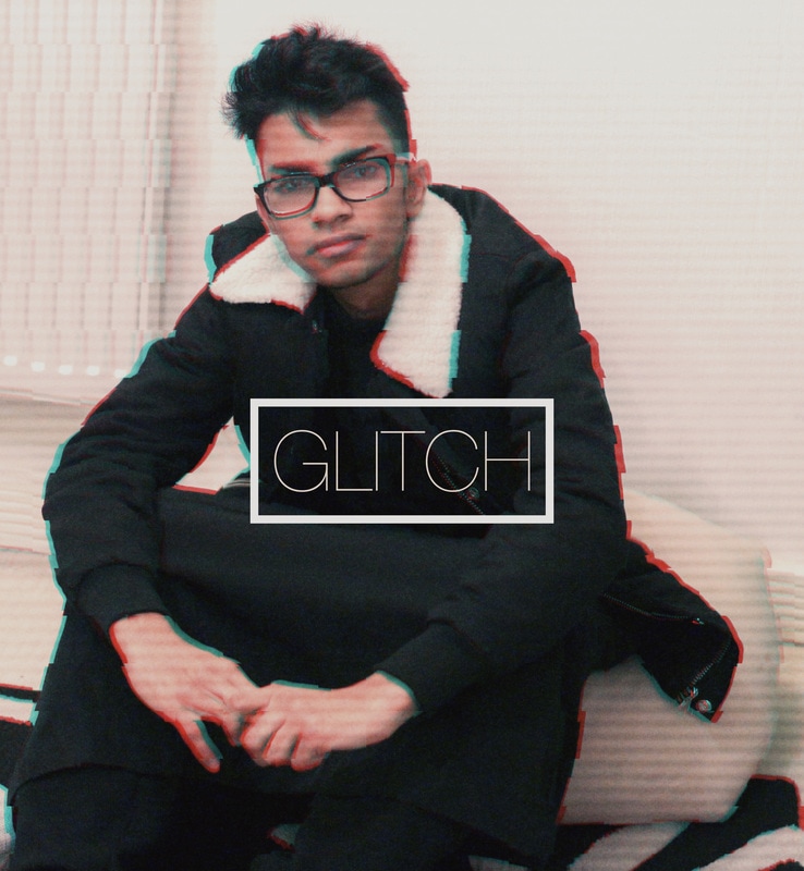
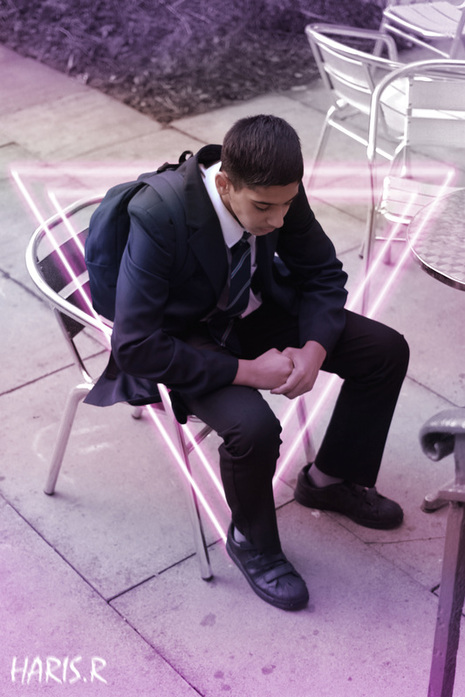
Shoot 2


1st Edit
|

|
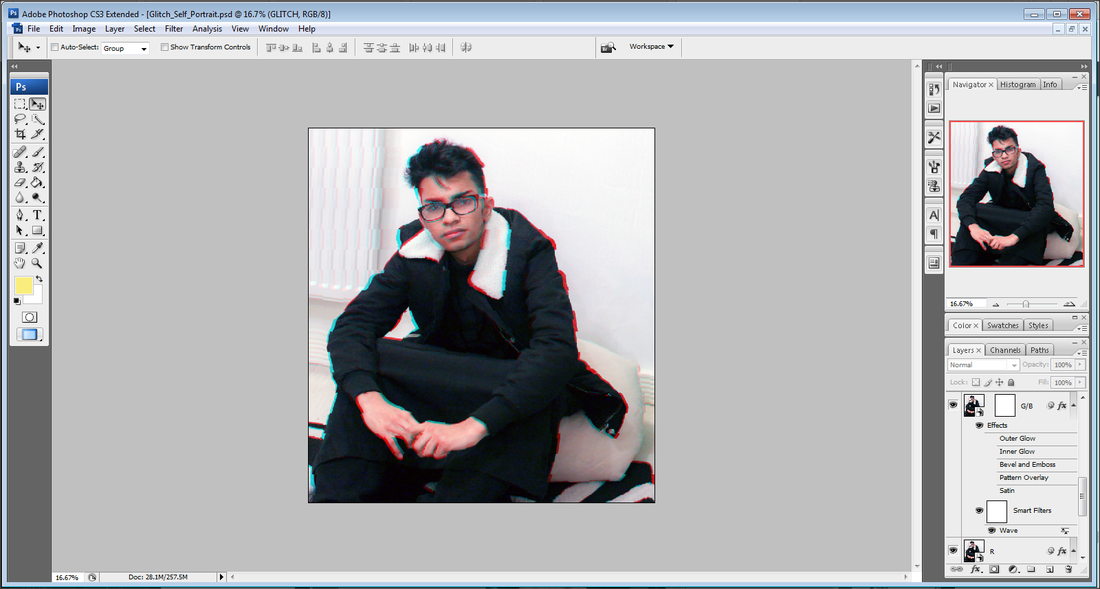
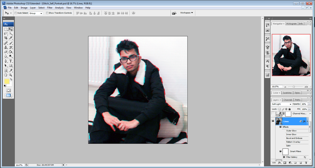
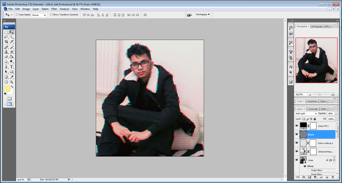
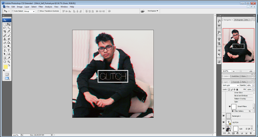
Canon EOS 700D + 40mm Pancake Lens - 1/125 Shutter Speed, f/2.8 Aperture, ISO 200
Editing Process

|
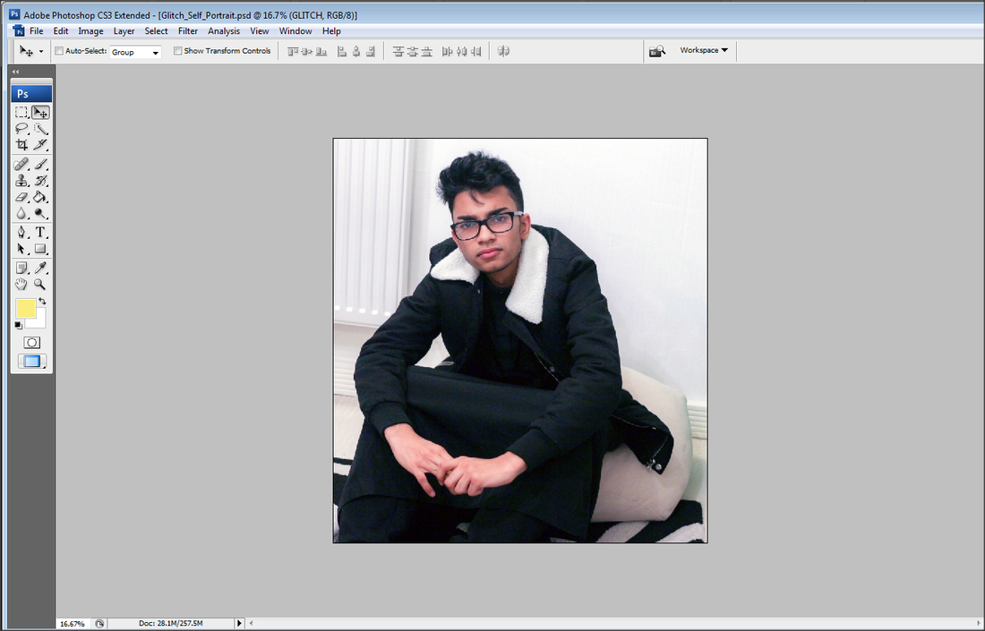
1 - Imported my RAW photo into Photoshop.
|

|
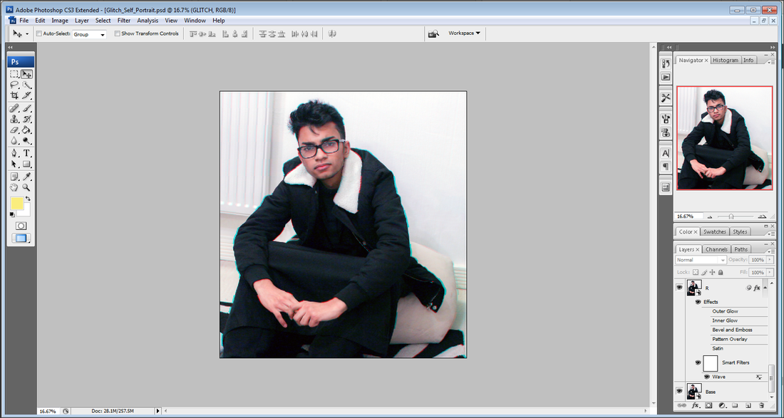
2 - I added a black and white adjustment layer.
|

|
3 - Using the pen tool, I selected the outline of my model and created a layer mask so I could place layers behind him. I then placed the layer mask layer above the black and white adjustment layer so it was in colour.
|

|
4 - Using the polygon shape tool, I created two triangles and placed them inside each other. I then used the motion blur tool to slightly blur the triangle.
|

|
5 - Using the blending options, I added a pink outer glow and used the colour overlay to change the colour of the triangle to white.
|

|
6 - I then placed the triangle shape layer below the model layer mask.
|

|
7 - Using coloured brushes, I brushed over certain parts of the image and adjusted the opacity and blending mode.
|

|
8- (Final Touches) I colour corrected my image by adding two adjustment layers and added some text into the bottom left.
|
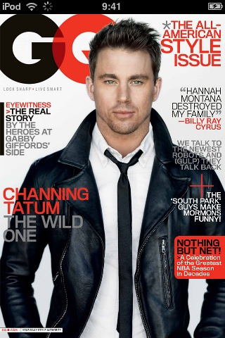
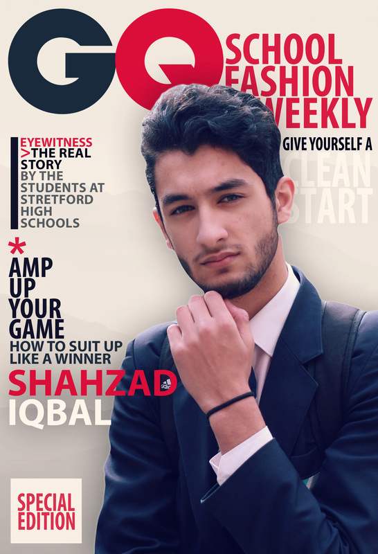
2nd Edit
|

|
Editing Process

|
1 - I Imported my photo, and cropped the model which was going to be used for the cover.
|

|
2 - Using the pen tool and refine edge, I removed the background behind the model. I also corrected the white balance.
|

|
3 - I added a gradient background, and imported a mountain texture to add to the background.
|

|
4 - I then imported the GQ logo, and added some text to go along with it.
|

|
5 - I added the rest of my magazine like text.
|
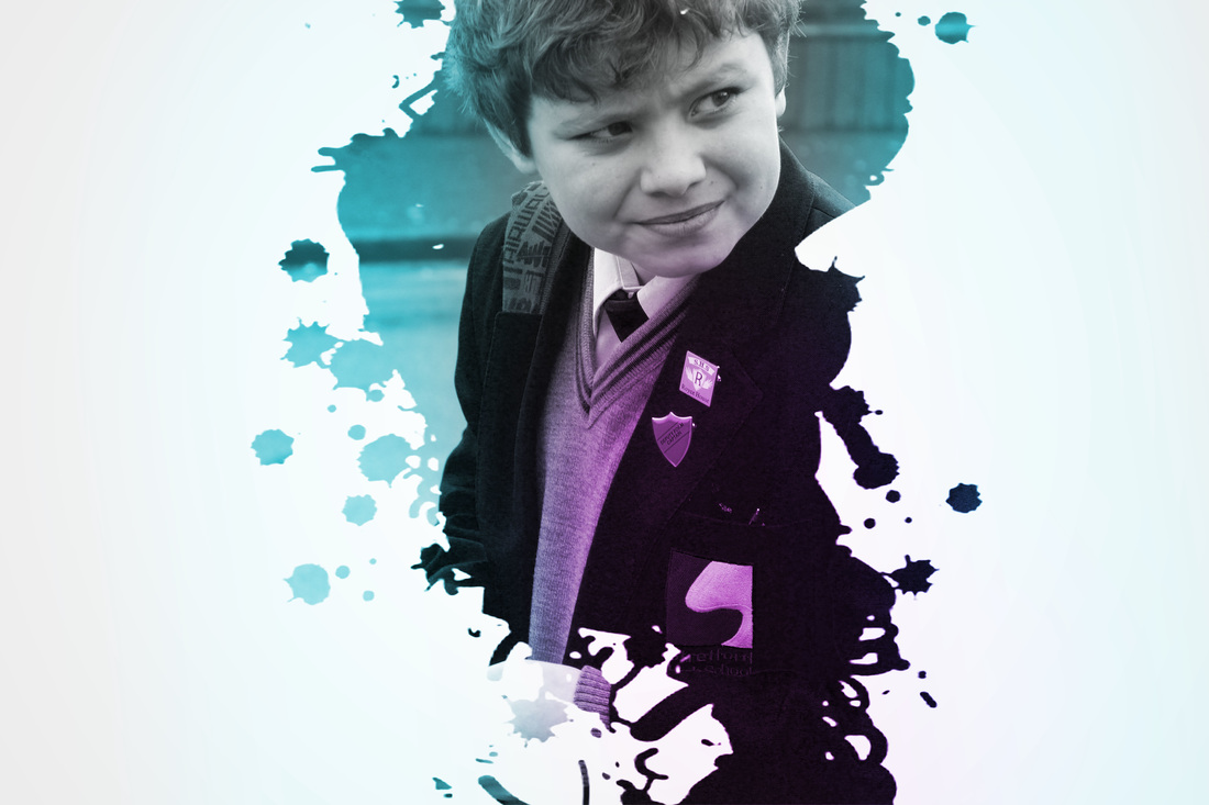
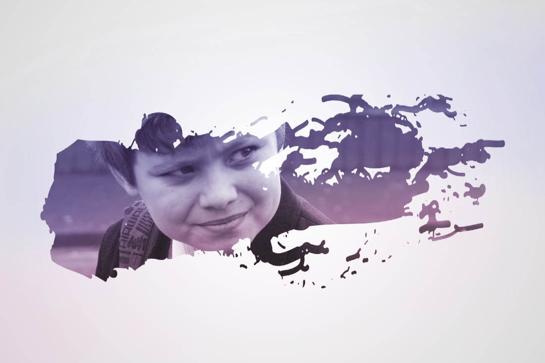
Shoot 3


Editing Process

Step 1 - I imported my photo into Photoshop and positioned the face in the middle.

Step 2 - I found some custom splatter paint brushes and I created a layer mask over the image.

Step 3 - I created an empty layer and added a gradient overlay for the background.

Step 4 - I added a black and white filter, and adjusted the hue and saturation.

Step 5 - Using the paint brushes, I created stripes of colour and set the layer blending mode to soft light.
Final Piece

2nd Attempt (Terrible colour choices)
- Shoot 4 -


- Shoot 5 -
UNIT EVALUATION
PORTRAIT
Some of the artists I researched was: David Woolfall, David Lazar and Daisuke Takakura. My favourite overall artist would have to be David Woolfall just because of his pure simplicity that is shown throughout all his photographs. I was inspired by his style, and added my own flair on top of it. This is definitely one of my favourite sub-units so far. It has allowed me to show off my Photoshop knowledge and editing skills. I ended up ditching half of my plans because I found much better, and interesting ideas off YouTube and DevianArt. These inspired me to make things unique, and different compared to everyone else.
Linking To My Research
In my research, I looked at a photographer called David Woolfall. I had liked the way he had used colours in his portrait photograph, to enhance a boring photo. I attempted a version of it, but I ended up with a very different and abstract result, but the same kind of effect.

|

|
- Hall of Fame -
|
|
|
|

