- Slinkachu Research -
|
Slinkachu also known as "Stuart Pantoll" is a well known photographer. He is based in London, in it's simplest terms, he creates an urban situation on a very small scale. He uses small figures, and props to produce some very unique, and interesting work. Stuart is a street photographer, and is famous for his "Little People's Project".
|

|
- His Work -


|
His "Best Photograph" - This photo for me describes what Slinkachu does. The picture is really simple, but yet so effective. It's showing a small man that has been stepped on, and is bleeding in the snow to his death. I just really like it because its a story in a very simple photograph. Stuart uses the rule of thirds to focus your attention on the blood, and the character on the floor. He also uses has taken the photo with a small depth of field which also ties in to the audience being attached to the character and blood.
|

|
His "Worst Photograph" - In my personal opinion this is probably the worst photo from his "Little People Project". Unlike most of his other photographs, this one doesn't a whole lot interesting. Maybe if the headphones were smaller just to suit the figure a bit more. It's a good photo, just not as good as some others.
|
- Mike Stimpson Research -

|
Balakov also known as "Mike Stimpson" is a toy photographer. He was born and still lives in the West Midlands, England. His main job is working for a video game company so photography is really only a hobby for him. He mainly uses Nikon Cameras. Most of his photographs feature Lego Figures, which is where I got my inspiration from. His work has been published in newspapers all over the UK, and some work featured on TV.
|
- His Work -


|
His "Best Photograph" I think this is one of his better images he took. It's a Lego storm-trooper figure popping out of a keyboard, lifting up a key. The black and white effect also added. The shallow depth of field focuses on what is most important, to achieve this he used a low aperture, since this was taken indoors, he would have to of used a low shutter speed to get his desired effect, and the most light possible. It also uses the rule of thirds composition rule. This is also another image, that is so simple, but still gives the viewer a message.
|

|
|
His "Worst Photograph" I don't know, but this one doesn't look up to standards as the rest of his photographs. It's still a decent photo, but maybe he could of taken from a better angle, like from behind the figure. In addition, I would make the background more interesting by making it green so it could complement the red light saber. This would make it stand out more, and add contrast. I would also of liked to see a bit of shallow depth of field in the photo. For me it looks a little over exposed.
|

|
- Un Petit Monde Research -
|
Un Petit Monde means "A Small World" in English. There are two photographers behind it, Kurt and Edwige. They started in 2010 and they focus 100% creating, processing, planning and shooting in every photograph. He used to be a graphics web designer in the 1990's, but left his agency, and got into photography. Their project "Un Petit Monde" is based on creating miniature scene in a real life environment using only natural light.
|

|


|
His "Best Photograph" This photograph in my eyes has a very clear meaning. It shows 3 people in hazmat suits walking among a ditched beach. The 3 people look like they are looking for something, and there is the big toilet in the background. They also look very noticeable from the environment. The ultra wide angle lens also makes it look really cool. The depth of field isn't too shallow, so the background isn't just blown out, but just right, keeping the right amount of detail in the foreground and the background. Also you can see the they have used the rule of thirds so your attention is right in the center. The shape of the sand also create a compositional triangle.
|

|
His "Worst Photograph" This image shows a women that looks like she has just walked into a room, and feels threatened when coming face to face with a pig. The message in the image is clear, but a few changes should of been made. The first is the wide angle lens used, when he uses it in other photographs, it looks great. In this case however, I don't think it works. I think it would of been better without the fish eye effect. The lighting does however suit the environment creating a tense mood. I think maybe instead of it being a grown women, it should of been maybe of been a group of children. Also, I am not a fan of it being a portrait shot, especially for something like this. If we could see more of the environment, then maybe it would give the audience more hints of what the image is about. I would also have a little sign somewhere saying "Beware of the Dog" or something along those lines.
|
- First Shoot -


|
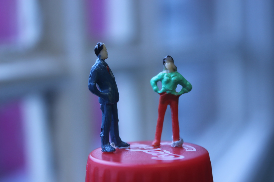
The Best Photograph.. "The Argument."
I think this is probably my best picture from this shoot. I liked the way the figures are the only thing it focus, giving it a more defined look. The focus point was not set properly, as the women figure is not clear. It's based upon, two parents having an argument over a coke bottle. Next time, we go for another photo shoot, I will bring along a gorilla Pod, so I can use lower shutter speeds because the lighting was really bad. |

|
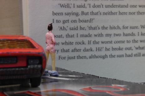
The Worst Photograph.. "Father & Daughter Argument."
I think this is my worst picture, first of all, the photo was taken with a low shutter speed, and without a tripod, meaning some motion blur was present. The focus point was slightly off, because more of the window was in focus than the figures themselves. Also I could of minimized the amount of blue tack to give it a cleaner look. To Improve this photo, I will use a tripod to use a low shutter speed without no motion blur & focus it correctly so that the figures are easier to see. |
- Conclusion (First Shoot) -
The first shoot wasn't the best, I could of done a lot better with a Gorilla Pod and some more time. Things like the blue tack, could have been reduced, and I think most of the photographs that I had taken have no meaning or message behind them. Next time we go for another slinkachu photo shoot, I will make sure that I bring some props as well to put some sort of message in some of the pictures.
- Second Shoot -


|
The Best Photograph. The only thing that made this some what better than the others is because the main subject is in focus and the picture doesn't look shaky compared to the rest. The idea in general I think was really bad. At the time of taking the photo, I tried to use the rule of thirds which turned out to be ok. I think a gorilla pod would of been useful so I could of used a lower shutter speed. Also I could of taken the image from a better angle so more of the car, and book was present.
|

|
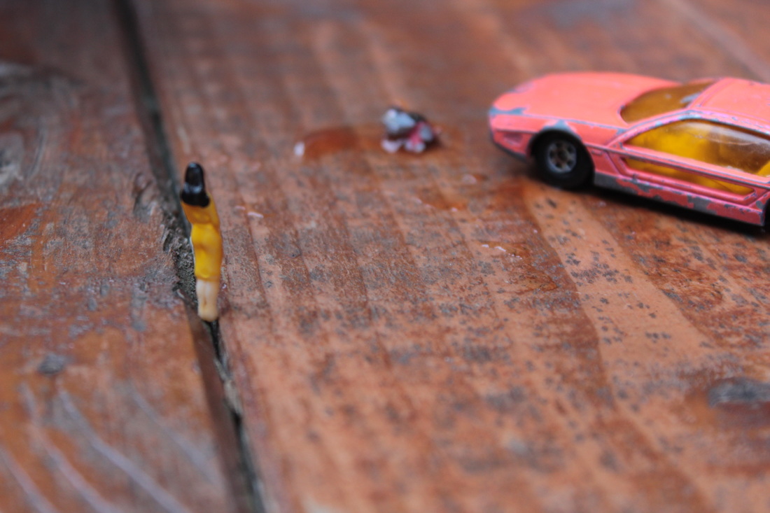
The Worst Photograph. This is in my opinion the worst photo taken from this shoot. The shutter speed was really low because of the lighting conditions, so that did introduce some shake into the picture, that could have been resolved with a tripod. The image is meant to illustrate a car accident. I think it could of been better if I had chosen a darker surface to mimic a road. Some parts of the photo were a tad over exposed, this could of been fixed by using a higher shutter speed or using HDR.
|
- Conclusion (Second Shoot) -
This was by far my worst photo shoot of them all. The props were not the best, and every single one of my images were either not correctly focused or the shutter speed was not correct. On some of the photographs I had taken, you can see some ghosting of the props. If I hadn't forgotten to bring a tripod, then I don't think they would be as bad.
- Third Shoot -


|
The Best Photograph. This shoot was done in about 30 minutes, and from the 6 images I took, this was the best. This photograph illustrates a car accident ,and a nearby women who is a bystander glaring at it. The focus was really nice, and the low aperture was used to some what blur the background. Shutter speed was set to around 1/100 which let just the right amount of light into the camera sensor. In addition to that, the rule of thirds was also used. Comparing this to the other photos in my shoot, this photograph shows a story.
|

|
The Worst Photograph. Everything about this photo from a glance is good. The focus is on point, the background is nice and blurry due to the f/3.5 aperture and focus point. There is no real message behind this image either. You can see the blue-tack which is one of the most biggest mistakes, also there is no photo composition rules applied. To Improve this photo, I would need to bring in some props or another figure just to show more happening.
|
- Conclusion (Third Shoot) -
This is another shoot that didn't go to plan. We only had 30 mins for this shoot, and as you can tell, not much work was done. I think the car accident photo was a good idea, but wasn't really executed that well. Overall I think this shoot was really a waste, but I guess we show improvement over time.
- Fourth Shoot -


|
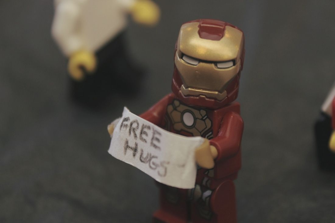
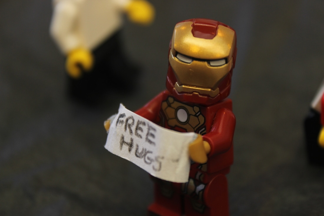
The Best Photograph. For this shoot, I decide to bring in some LEGO figures, and accessories from home. Unlike the school figures, these were more easier to position, and no need for blue-tack. The concept of this photo shoot was to show a man standing in a street holding a sign saying "Free Hugs". But unfortunately the background, and floor didn't turn out as I imagined. The focus was right on target, the low aperture allowed a nice blurred out background, and 1/50 shutter speed to let enough light into the camera. It would of been better if you could see more figures in the background, and if I used the rule of thirds.
|

|
The Worst Photograph. To start with, the angle of the shot was completely wrong, so you cant see the actual message I was trying to put across. The focus was actually good, and aperture and shutter speed were adjusted correctly. The LEGO figure was actually tipping over as well which was fixed in the next couple of photographs that I had taken.
To Improve this photo, I would need to take it at a better angle, from the front or turned the Iron-Man Lego figure itself. Also to make sure the figure was standing up correctly, and try avoid the blue wall in the background. |
- Conclusion (Fourth Shoot) -
This shoot, like the previous one was built up with great ideas, but it just didn't go how I expected it to. Some shots were pretty nice, but others were really lacking behind. This shoot could of been better if all the figures were much close together. I tried to re-enact a city street with people walking around. Also I should of taken it outside, and onto the road, to create a more fitting environment. In this shoot I tried to bring a little bit of humor into the images like Slinkachu try's to.
- Fifth Shoot -


|
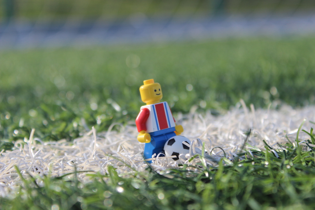
The Best Photograph. This was the picture I was proud of the most. You can see a Lego figure standing on the astro turf. I bought a miniature football which gives the audience more of a hint of what it's about. The focus was really nice as the aperture was wide open at f/3.5 at a 55mm focal length. The shutter speed was extremely fast at 1/10 because we were outside, and had plenty of light to work with. It could of been better if we used a the rule of thirds so people can see whats most important.
|
|
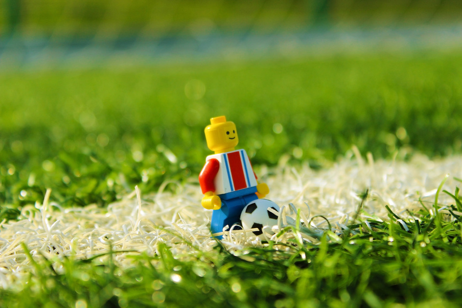
This is the Edited version of my Best photo. In photoshop, I added a lot more vibrancy, and saturation to make the colors pop. Also I made the greens a lot more noticeable by using the curves tool in photoshop. Overall, I think the edited image creates a more happier mood.
|

|
The Worst Photograph. This image was chosen as my worst. The 2 main reasons being the focus was not correct and there is some noticeable ghosting because of a low shutter speed that was used because the aperture was at f/36.
Also the figure doesn't look natural, and a bit over saturated. To Improve I would of had to keep the camera in a steady position to reduce the motion blur, and make sure the image was focused correctly. |
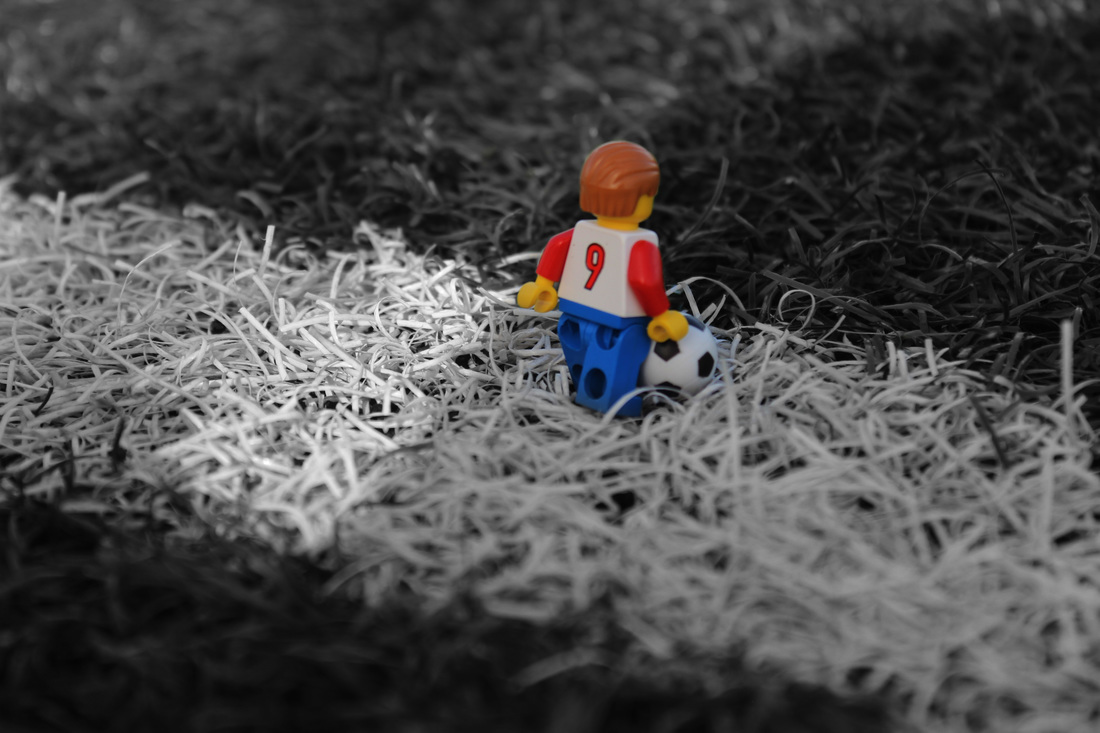
- Color Splash Edit -
|
|
- Conclusion (Fifth Shoot) -
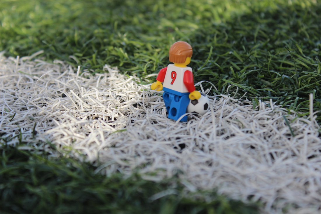
By far this was my favorite photo shoot. There was some more interesting photographs, and most were successful. I think the LEGO figure with the numbers on it's back suited the football environment very nicely. If I could do this photo shoot again, I would bring some blue-tack so I can stick it anywhere I want, and get some more better shots. Also I would bring more figures to create a better environment. This also links to my research because Slinkachu creates a story with his figures, and adding humour.
- Hall of Fame -
|

|
|

|
|

|
|
|

|

|

|

|
LINKING TO MY RESEARCH
Mike Stimpson, one of the artist I researched inspired me to start using LEGO Figures. This was because at home I had a large variety of all different type of figures, which meant that I could get quite creative with my work. I didn't like the little people that we were given as you had to use blu-tack to keep them in place, and because they were simply too small.

|

|
UNIT EVALUATION
SLINKACHU
